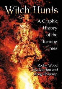
 Witch Hunts – A Graphic History of the Burning Times
By Rocky Wood & Lisa Morton
Illustrated by Greg Chapman
Publisher: McFarland
Paperback, 186 pages
ISBN: 978-0-7864-6655-9
Blurb: For three centuries, as the Black Death rampaged through Europe and the Reformation tore the Church apart, tens of thousands were arrested as witches and subjected to torture and execution, including being burned alive. This graphic novel examines the background; the witch hunters’ methods; who profited; the brave few who protested; and how the Enlightenment gradually replaced fear and superstition with reason and science. Famed witch hunters Heinrich Kramer, architect of the infamous Malleus Maleficarum, and Matthew Hopkins, England’s notorious “Witchfinder General”, are covered as are the Salem Witch Trials and the last executions in Europe.
Way back when I had just started High School I discovered, in the library, graphic novel versions of Shakespeare’s Hamlet, Othello and Romeo and Juliet. There were also graphic novels of the life of Genghis Khan and Alexander the Great. They were brilliant. They not only introduced me to wealth of historical figures and to Shakespeare’s genius but they cut through all the hard work of the original texts. They presented art and history in a visual way that made the past exciting and interesting. It is something that stuck with me. It is something that helped pave the way for my own journey to becoming a writer and illustrator.
What has ‘Witch Hunts – A Graphic History of the Burning Times‘ to do with this?
Well, I think they’re much the same. On opening ‘Witch Hunts…‘ for the first time, I was struck with a wave of nostalgia. Like I was that little kid in the school library, just now pulling down one more book after all these years. Within a couple of pages — or maybe it was only a couple of panels — I was hooked.
‘Witch Hunts – A Graphic History of the Burning Times‘ begins with a brief introduction, an overview that sets the direction and tone of the work. There’s a bit of time-jumping in the chronology of this section, but bear with it. ‘Witch Hunts…‘ very soon settles into a detailed chronological telling of ‘The Burning Times’ (roughly 14th to 18th centuries) and beyond to the horrors still perpetrated around the world today.
A couple of things struck me about ‘Witch Hunts…’. Firstly, the obvious knowledge of the authors is there in every word. It was sort of amazing to me, as I read, to see how much history they’d encapsulated within such short bites. To distil all that information down to just a few words shows a real depth and understanding of the subject matter. Also, I felt I learnt more, retained more, and enjoyed it more than I ever have any history text-book. HWA President Rocky Wood and Bram Stoker Award winning author Lisa Morton really have to be congratulated on achieving such a feat.
Secondly, the artwork by Queensland author/illustrator Greg Chapman is spot on for the work. The style is not that of the modern ‘comic’ — all mood, bold blacks filling 80% of a panel — but much more what I remember from those old Illustrated Classics in the library — less chiaroscuro, more detail, more character. Again, as with the authors, the research that must have gone into each and everyone of Chapman’s illustrations is mind boggling. To be honest, I’m no expert on any of this stuff, but every page looks authentic. The clothing, the hairstyles, all the little objects in the background. They mesh perfectly with the narrative, really drawing you into the stories that Wood and Morton are telling.
The overall narrative is one we’re all familiar with through the culture of horror-literature and -cinema: that despicable period of inhumanity that began with the Spanish Inquisition and spread as Witch Hunts and Witch Trials throughout Europe and the New World. But Wood, Morton and Chapman take us beyond that; back to the religious and biblical origins of ‘Witchcraft’ as an evil and as a sin in the introduction, then later beyond the 18th Century. They also delve deeper. They offer up an onslaught of historical events and incidents. Grotesque images by Chapman. Individual things that happened to individual people, and these people had names. Sure, I’d sort of read and seen TV docos on the sort of things that the Catholic Church did in the 15th Century, or what occurred in Salem. But never before has this history been shown to me on such a personal level. As I said, these people had names, and now I know some of them. That has to bring anyone closer to history, doesn’t it? Gets you right in there, and you begin to really understand what these people went through. Isn’t that what learning history is all about?
That’s where ‘Witch Hunts – A Graphic History of the Burning Times‘ really worked for me. It showed me stories of real people. All the horror and the torment they went through and all the madness of the people who’d condemned them. It certainly is graphic — Chapman’s illustrations are often more uncompromisingly gruesome than the text — but it serves to show a truth about our past that we should not shy from. In light of some of the religious and political events happening around the world today, remembering that truth seems, to me, an especially important thing.
Ultimately, ‘Witch Hunts – A Graphic History of the Burning Times‘ is informative in a way few non-fiction works are, and it’s great-looking too! Definitely a worthwhile addition to any horror reader’s or writer’s library.
 Terra Magazine, Issue #1
 The Sixsmiths is a graphic novel (born of a webcomic) written by Jason Franks and illustrated by J Marc Schmidt. It’s the story of an everyday surburban family, the titular Sixsmiths, who live in Albert Hills, Victoria. A pleasant couple with two kids (Cain and Lilith) and a dog (Furfur), they’re about as normal as a family gets. Which is the key point of this story, as they’re committed Satanists.