Don’t Let Us Lose Another Bookshop

Some grim news came out today regarding Notions Unlimited Bookshop, one of Australia’s favourite bookstores. Owner-operator, all round good guy, and king of all that’s spec-fic, Chuck McKenzie, announced that the bookshop is in very real danger of closing by Christmas or soon after, due to the ever rising costs of running a business.

The following is taken directly from the Notions Unlimited Bookshop‘s website:

Since the day we opened our doors, just 20 months ago, the staff and management of Notions Unlimited Bookshop have worked hard to create something more than just a specialist bookstore, and we feel genuinely proud of much that we’ve achieved during that time, such as:

# Continuing to offer a great range of publications, including the best of Australian small-press, rare and hard-to-get titles, genre classics, and latest new releases.

# Building and maintaining a reputation for friendly and knowledgeable service.

# Keeping our prices reasonable – no mean task in these days of Internet shopping and global economic downturn.

# Becoming accepted as part of the local community, plus creating an ever-growing community of our own, bringing together fans of SF, fantasy, horror, graphic novels, gaming, manga, esoteric interests and more – something we’re especially proud of, and that we hope to continue doing for a long time to come.

In order for us to reach that last goal, however, we really do need the assistance of our customers, general supporters, and Facebook subscribers at this time.

Currently, Notions Unlimited Bookshop is looking at the very real possibility of closure – if not by Christmas, then perhaps just afterwards – with the chief cause being the ever-rising cost of running the business. It’s not definite at this point, but the writing is on the wall, and this appeal is an attempt to reverse matters before it’s too late.

Our aim, therefore, is not just to increase our daily sales, but to substantially increase the number of potential customers. Previously, we have tried to boost customer numbers through signage, social media and print advertising – yet almost 80% of our customers tell us they discovered us through referral from friends, family or colleagues.

So this is exactly what we’re asking our friends and customers to do for us now – refer us!

In a nutshell, while we’d love you to pop into our shop over the next few weeks and purchase a book (or two) to help keep us afloat, what we really want you to do is tell other people about us. Jump on Twitter and Facebook, tell your friends, family, workmates, and anybody else you know who loves SF, fantasy, horror, graphic novels, manga, media tie-ins, gaming, esoteric subjects, and other such related genres, to come and check us out in person (and then tell all of their peeps!). We’re not looking for handouts – just introductions to potential customers who may help to keep us in business. And do be sure to mention to everyone you refer us to that this is all in aid of keeping Notions Unlimited Bookshop operating.

Finally, I just want to make it absolutely clear that this is a genuine appeal, not some fake ‘going out of business’ sale or marketing trick. If things don’t improve markedly for us over the next month, we will almost certainly be forced to close our doors forever. No business owner ever wants to admit that a business is failing, but there comes a time when that owner has to either quietly slide towards the inevitable, or step into the spotlight and ask for assistance. So, if you feel you can assist, and will do so, you will have the absolute gratitude of myself and my staff – as well as, hopefully, a future in which we may continue to provide you with the range, service and community you deserve.

In the meantime, a massive and heartfelt ‘thank-you’ to all of our customers, regular and casual, who have supported us already since we opened. We couldn’t have survived thus far without you.

With Thanks,

Chuck McKenzie (Chief Zombologist)
Notions Unlimited Bookshop
facebook.com/pages/Notions-Unlimited-Bookshop/
@notionsun
info@notionsunlimitedbookshop.com

Bookshops are an endangered entity in this day and age, and whenever one closes its doors for good, we are all a little poorer for it. Don’t let this happen to Notions Unlimited Bookshop. Please help in any way you can.
Review: Witch Hunts – A Graphic History of the Burning Times

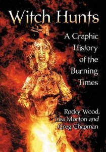
witch-hunts-a-graphic-history-of-the-burning-timesWitch Hunts – A Graphic History of the Burning Times
By Rocky Wood & Lisa Morton
Illustrated by Greg Chapman
Publisher: McFarland
Paperback, 186 pages
ISBN: 978-0-7864-6655-9

Blurb: For three centuries, as the Black Death rampaged through Europe and the Reformation tore the Church apart, tens of thousands were arrested as witches and subjected to torture and execution, including being burned alive. This graphic novel examines the background; the witch hunters’ methods; who profited; the brave few who protested; and how the Enlightenment gradually replaced fear and superstition with reason and science. Famed witch hunters Heinrich Kramer, architect of the infamous Malleus Maleficarum, and Matthew Hopkins, England’s notorious “Witchfinder General”, are covered as are the Salem Witch Trials and the last executions in Europe.

Way back when I had just started High School I discovered, in the library, graphic novel versions of Shakespeare’s Hamlet, Othello and Romeo and Juliet. There were also graphic novels of the life of Genghis Khan and Alexander the Great. They were brilliant. They not only introduced me to wealth of historical figures and to Shakespeare’s genius but they cut through all the hard work of the original texts. They presented art and history in a visual way that made the past exciting and interesting. It is something that stuck with me. It is something that helped pave the way for my own journey to becoming a writer and illustrator.

What has ‘Witch Hunts – A Graphic History of the Burning Times‘ to do with this?

Well, I think they’re much the same. On opening ‘Witch Hunts…‘ for the first time, I was struck with a wave of nostalgia. Like I was that little kid in the school library, just now pulling down one more book after all these years. Within a couple of pages —  or maybe it was only a couple of panels — I was hooked.

Witch Hunts – A Graphic History of the Burning Times‘ begins with a brief introduction, an overview that sets the direction and tone of the work. There’s a bit of time-jumping in the chronology of this section, but bear with it. ‘Witch Hunts…‘ very soon settles into a detailed chronological telling of ‘The Burning Times’ (roughly 14th to 18th centuries) and beyond to the horrors still perpetrated around the world today.

A couple of things struck me about ‘Witch Hunts…’. Firstly, the obvious knowledge of the authors is there in every word. It was sort of amazing to me, as I read, to see how much history they’d encapsulated within such short bites. To distil all that information down to just a few words shows a real depth and understanding of the subject matter. Also, I felt I learnt more, retained more, and enjoyed it more than I ever have any history text-book. HWA President Rocky Wood and Bram Stoker Award winning author Lisa Morton really have to be congratulated on achieving such a feat.

Secondly, the artwork by Queensland author/illustrator Greg Chapman is spot on for the work. The style is not that of the modern ‘comic’ — all mood, bold blacks filling 80% of a panel — but much more what I remember from those old Illustrated Classics in the library — less chiaroscuro, more detail, more character. Again, as with the authors, the research that must have gone into each and everyone of Chapman’s illustrations is mind boggling. To be honest, I’m no expert on any of this stuff, but every page looks authentic. The clothing, the hairstyles, all the little objects in the background. They mesh perfectly with the narrative, really drawing you into the stories that Wood and Morton are telling.

The overall narrative is one we’re all familiar with through the culture of horror-literature and -cinema: that despicable period of inhumanity that began with the Spanish Inquisition and spread as Witch Hunts and Witch Trials throughout Europe and the New World. But Wood, Morton and Chapman take us beyond that; back to the religious and biblical origins of ‘Witchcraft’ as an evil and as a sin in the introduction, then later beyond the 18th Century. They also delve deeper. They offer up an onslaught of historical events and incidents. Grotesque images by Chapman. Individual things that happened to individual people, and these people had names. Sure, I’d sort of read and seen TV docos on the sort of things that the Catholic Church did in the 15th Century, or what occurred in Salem. But never before has this history been shown to me on such a personal level. As I said, these people had names, and now I know some of them. That has to bring anyone closer to history, doesn’t it? Gets you right in there, and you begin to really understand what these people went through. Isn’t that what learning history is all about?

That’s where ‘Witch Hunts – A Graphic History of the Burning Times‘ really worked for me. It showed me stories of real people. All the horror and the torment they went through and all the madness of the people who’d condemned them. It certainly is graphic — Chapman’s illustrations are often more uncompromisingly gruesome than the text — but it serves to show a truth about our past that we should not shy from. In light of some of the religious and political events happening around the world today, remembering that truth seems, to me, an especially important thing.

Ultimately, ‘Witch Hunts – A Graphic History of the Burning Times‘ is informative in a way few non-fiction works are, and it’s great-looking too! Definitely a worthwhile addition to any horror reader’s or writer’s library.

Review: Terra Magazine Issue #1

Terra Magazine, Issue #1
Edited by Jason Franks
ISBN: 9781921872167
Publisher: Black House Comics

Terra Magazine, from Sydney-based Black House Comics, is a throw-back. A return to comics of a different era. Without political or social agenda, they were made to entertain; to shock and to thrill and to make you laugh. In many ways, Terra Magazine reminds me of that. Of EC Comics and early 2000AD.

In Terra Magazine‘s first issue, editor Jason Franks has assembled a varied collection of artists and writers. And an even more varied collection of genres. The almost Frazetta-like cover by Jason Paulos, the first thing that will catch your eye on the news-stands, is a brilliant evocation not only of the first story (see below), but also of the pulpish nature of the entire comic/magazine.

From the opening “Gourmand Go in ‘Memorial Soup’“, written by Franks with artwork by Harry Purnell, we are thrust immediately into deep space. This is exactly the sort of tale I remember reading in old 2000ADs; a ship crewed with human mercenaries, stuck drifting due to a busted Fission Drive, their distress signal picked up by the biggest, ugliest, meanest looking cockroach-lobster aliens in the galaxy. But you just know there is going to be a twist. While not exactly unpredictable, the story is fun. The writing is clear and concise and the artwork crisp and quirky.

Next up, we’re off to feudal Japan for “Kensuke“. Written again by Franks, but with artwork by Tom Bonin, this story couldn’t be more different than the opener. What struck me most was the total change, not only of genre, but of the feel of the artwork. While Purnell’s art for “Gourmand Go…” consisted of crisp line-work and lettering, Bonin’s approach in “Kensuke” is much rougher, sketchier, offering up a style more in line with the setting. And the story? Samurai warriors. Martial arts monks. Court intrigue. Concubines. Ninjas. Need I say more?

It is these shifts in genre and style that make Terra Magazine so much fun. The very next story, “The Catamorph“, with a script by Chris Sequeira and art by Jan Scherpenhuizen, places us firmly back in EC Comics ‘Tales from the Crypt‘ territory. Two cops respond to a break and enter alarm from the posh-end of town only to encounter a — quite animated — Ancient Egyptian mummy, and so much more besides. The script and artwork are sort of timeless in this supernatural-noir tale. It could be the 60s, or the 70s, or any decade onwards. I tend to favour a late 80s setting – wait until you see the push button phone in the Police Office! Apart from these initial panels though, there isn’t much in the way of visual clues to tell us exactly ‘when’ we are… and I see this as a good thing leading forward for “The Catamorph“. As I said: timeless.

Shadowmancy: Episode 1, The Key in the Wall“, with a script by Jason Franks and art by Nicholas Hunter, continues on in a similar mode. The artwork is more modern, with sharp Manga-inspired lines, but the story is still straight out of something I would have read as a kid in the 70s and 80s. For me, a new and refreshing take on that nostalgia seems to be what Terra Magazine is all about. In “Shadowmancy…“, young Quay decides the follow his mysterious and often absent father, only to find himself the centre of a battle between powerful sorcerers at a secret academy. The panels in this segment are really well composed. The script is sparse and increasingly intriguing. Once begun, I just had to keep going through to the end … and this is where I was reminded of what might be Terra Magazine‘s single downfall.

The story sequences are just too darn short!

Of those reviewed so far, only “Gourmand Go…” has anything resembling a self-contained story. I’m hoping for more stories set on that deep space kitchen, but if not, that’s okay. Everything else, though? Yep! To Be Continued…

It might not be so bad if the stories weren’t all so good. So much fun. Maybe then, I wouldn’t have to worry about the wait between issues. But, tri-annual? I have to wait one third of a year before I get to see if Imperial Guard Kenuke gets away? Or whether detectives Vic and Doyle get any closer to discovering the Mummy’s secret? That’s quite a torturous wait for a reader, especially when the story crumbs are so small (but oh so tasty). “Shadowmancy...” was, to me, the most interesting story in terms of future development, but just for one more page, or another two pages, or three! I definitely feel it could have given more.

Gun Smoke Bud“, with a script by Jason Franks and art by Yuriko Sekine, is in a style I’m not overly familiar with. I’m guessing it’s manga inspired. The story is simple enough — Two Tokyo detectives investigate a Yakuza massacre at a shopping mall, their only witness? A young stoner — but it doesn’t give us much indication of where it might be heading in the future. And after the crisply stylised lines of “Shadowmancy“, the artwork didn’t do that much for me.

The final panelled story is Ben Michael Byrne’s “Prototype“. Written and illustrated by Byrne, “Protoype” is another short, self-contained, 2000AD style sci-fi story. Nothing serious, just good fun with the usual gruesome twist at the end. The darker, blockier artwork really suits the piece and it is quite different from anything else in the magazine. I can see this continuing with a new short, and comically-nasty, story each issue.

Which brings us to the final story, “Tusk” by Jason Fischer, which isn’t a comic at all. Still in keeping with the serialised nature of the magazine, “Tusk” plumbs the Golden Age of genre fiction with something that could have come right out of an early 70s issue of Analog. “Tusk” is straight prose — with a few Rhys James illustrations sprinkled throughout — of the sort that Mr Fischer has become well known for: tight, well written, original and more than a little bit gonzo. “Tusk” is The Planet of the Pachyderms with a healthy dash of Robert E Howard thrown in. A post-apocalyptic world run by a civilisation of war-like elephants. Talking warrior elephants, no less. Who enslave humans. And they wear ‘swords’ on their tusks! Count me in! Not only are the battle scenes tremendous, but there are hints of a much deeper story developing here. I very much look forward to reading more of “Tusk” in future issues.

So, that’s that. My non-comicaknowledable take on what I think is a really excellent debut. Terra Magazine is a great blend of exactly the sort of comics and tales that got me reading as a kid — a wonderful retro revival that, despite its obvious influences, still offers something new and refreshing for readers of both comics and of genre fiction. It should be available on your local newsagent and comic store now, or you can visit www.terramagazine.com.au Let’s hope Black House can keep the issues coming!

Killeroo Gangwar – review

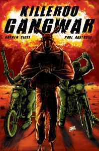
Killeroo Gangwar is a graphic novel by Darren Close and Paul Abstruse. It’s an incredibly Australian production, as the title and cover image to the left should make obvious. The titular character is a hard-as-nails human/kangaroo hybrid motorcycle gang leader. That in itself is actually a pretty awesome idea. Gangwar tells the story of Killaroo’s gang, The Outback Warriors, and their encounter at a roadhouse with rival gang, The Redbacks.

However, as far as a story goes, it’s more of an introduction or a prologue than an actual yarn. The book is very short, only about fifteen pages or so, and there’s really no time to develop any great depth. As introductions go, it’s very good. The artwork is excellent and very filmic in a bold, black and white style. That artwork conveys the story and action very well, and the violence and attitude of the whole piece are superbly realised.

The trouble was, I got to the end of this short book and felt like the thing had only just started and I wanted more. I can only assume there is more out there and there’s the potential for this idea and these characters to be explored in a variety of interesting stories. A quick web search certainly seems to hint that there is a lot more out there: this blog post gives us some information.

This is definitely one of the slicker and more professional local graphic novels that I’ve seen and I’d be intrigued to read more. For just six bucks, Killeroo Gangwar is definitely worth a look to see if it catches your interest too.

.

The List by Bedford, Pop, Bonin – review

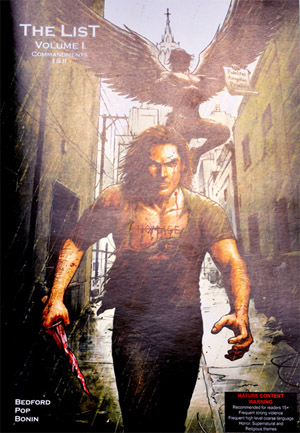
The ListThe List is a graphic novel written by Paul Bedford and illustrated by Henry Pop (pencils) and Tom Bonin (inks). It has lived through many incarnations, originally released in serial form and now available as a self-published single-volume graphic novel. It’s interesting to note that this edition was financed through crowd-funding with a successful Pozible campaign.
The List tells the story of a young man with a deep obsession. He has a list tattooed on his stomach, given to him by an angel. His father has already completed his list and reached “enlightenment” and the son must now work through as his father did. The angel drives him on, the ghost of his father lambasts his mistakes and the reader is never really sure if any of it is real or just extensive psychosis on the part of the son, Matthew.

This is the key idea behind the narrative style. Very little is given away and there’s a lot of room for interpretation, which is generally a good thing in any story. The tale is violent and powerful and does little to protect the reader from the depths of insanity surely gripping Matthew. Clearly this book has a lot of fans (given the crowd-funding success and many positive reviews) but I have to admit that I found the whole thing rather two-dimensional.

The art style is bold and stark, which works in many ways, but the consistent lack of backgrounds and the constant use of solid black or solid white in panels made the book seem stangely flat. This helps to focus on the story, but it does detract from the immersive experience you’d expect from a graphic novel. There are several pages with very little text and panel after panel of story told purely with pictures, reminiscent of the cinematic style in books like Lone Wolf And Cub, and this works well, but still suffers from that lack of secondary detail.

The same can be said of the story. There’s really nothing else going on except Matthew and his list. The writing and story idea are servicable though not outstanding, but the focus is so tightly on the primary idea that we’re left with no nuance of world or place, or character history. I suspect this is deliberate, but it does leave the overall experience feeling somewhat empty and isolated in time and place.

However, having said all that, the tale is strangely compelling and I had no trouble reading the book in a single sitting. Several comments about the work try to draw attention to its no-holds-barred approach and unflinching horror and depravity, but it’s really nothing new in that respect. In fact, compared to something like Garth Ennis’s The Boys or Howard Chaykin’s Black Kiss, it’s positively tame. But I was pleased that the story was explored to its full depth and not sanitised. I would have liked more from both the story and the art, but I still found it to be a satisfying read. It’s something a bit different and a good effort from a team working in isolation and supported only by their passion and hard-earned fans. This is definitely worth a look for something unusual if you like your horror of the psychological and mysteriously supernatural kind.

See the dedicated website at: http://the-list.com.au/enlightenment/

.

The Sixsmiths by J Marc Schmidt and Jason Franks – review

The SixsmithsThe Sixsmiths is a graphic novel (born of a webcomic) written by Jason Franks and illustrated by J Marc Schmidt. It’s the story of an everyday surburban family, the titular Sixsmiths, who live in Albert Hills, Victoria. A pleasant couple with two kids (Cain and Lilith) and a dog (Furfur), they’re about as normal as a family gets. Which is the key point of this story, as they’re committed Satanists.

The story is told is several short chapters, starting with Ralf Sixsmith losing his job due to global financial pressures. He’s glum and the family talk about how they’ll need to seriously tighten their belts. But not to worry, says Annie: “The Dark Lord will provide.”

“We’ll have to make sacrifices, obviously,” says Ralf.

“I think a lamb and a goat for the equinox,” Annie replies.

There you have the measure of this story. It’s a light comedy drama, until you realise it’s telling the story of religious Satanists as casually as it would tell the story of Catholics. And that’s the point. Essentially, The Sixsmiths is exploring life for people of any faith and the problems they can face. The family are often either villified or admired for the strength of their religion. They all, even the kids, have dozens of Satanic tattoos, causing a stir in school change rooms. We learn of a third, oldest child, who is estranged from her family as she no longer shares their faith.

Ralf struggles to find employment while the kids struggle with life in the public school system now the family can no longer afford to send them to private school.

The artwork is spare and simple, but consistent and effective. Once you get used to the style of art and storytelling, the two fit together very well. There are poignant moments and a good dose of comedy. It’s all very entertaining stuff. There’s nothing ground-breaking or earth-shattering here, and I can’t help wondering how it might have been if the story was told from a much darker angle. But that’s the point really – it’s normal suburbia with Satanists who sacrifice “babies” made of cake at their rituals and try to live true to their faith against the odds. I enjoyed it.

My only real complaint is that the book ended right on a midway point with no indication that there was going to be any more. No Volume 1 on the cover or To Be Continued at the end. It just stops, on a fairly serious and depressing note. Maybe the intention was to indicate a “struggles go on” idea that doesn’t need to be told, but it took me by surprise and disappointed me. I’d have liked some closure, even if there was more story to be told. Everything set up through the story gets addressed or resolved up to a point, then it all just stops. Which was a bit weird.

On checking via the website, I noticed this mention:

Well, it’s official. Franks has started writing the script for Vol.02.

At this point that’s all the information we have, but Franks is extremely excited to have this opportunity to tell the rest of the story.

I also discovered from the website that:

The Sixsmiths webcomic is published weekly at www.thesixsmiths.com, to be followed by a graphic novel later in the year [presumably this book I’m reviewing]. The webcomic features short stories about the situations and characters portrayed in book, which is constituted of longer story arcs. Some of the webstrips will appear in the graphic novel.

Well, that’s good then. Some indication of all that in the book would have been good.

The Sixsmiths is published by SLG Publishing (www.slgcomic.com)

www.thesixsmiths.com

.